Notes: Purple not as strong on wall sample as in swatch.
Remember: some colour saturation will be removed by pull process- Affected colours tend to be bright "poppy" colours, other muted, pastel colours arent affected as much...
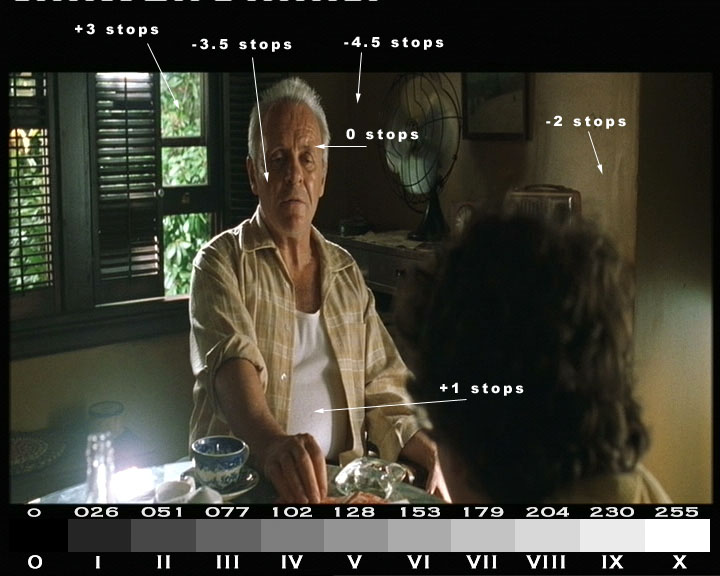
Some lighting exposure ratios from our resonances using Cinemate©glennhanns.
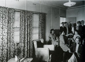
Fibro heaven:
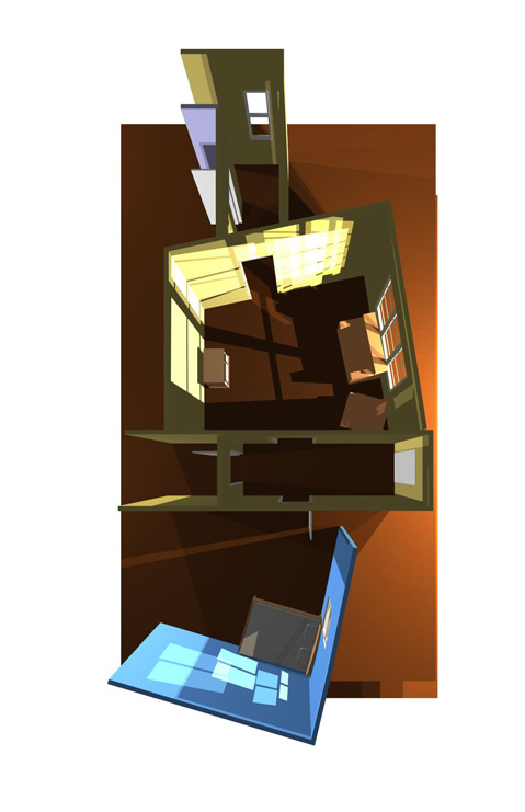
Set Design from Roger:
No comments:
Post a Comment