
Friday, September 29, 2006
Design- set and lighting design


FYI,
our intentions tomorrow at 2:00pm are:
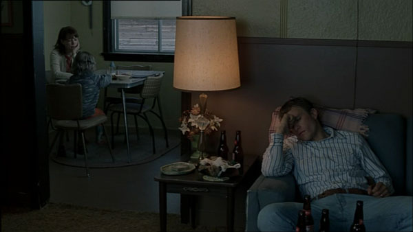
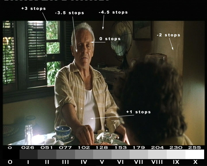
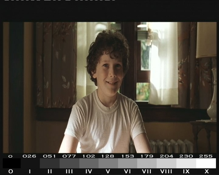
Contrast test- NORMAL PROCESS
a) 4 (2stops),8 (3 stops), 16 (4 stops) to 1 ratio key to phil. :O)
b) key over 1, 2 stops
c) colour added- chocolate and 1/2 CTS
Contrast test- PULL PROCESS
a) 4 (2stops),8 (3 stops), 16 (4 stops) to 1 ratio key to fill.
b) key over 1, 2 stops
c) colour added- chocolate and 1/2 CTS
The contrast tests will also be used as makeup tests.
If actors want to wear fabrics we can see fabric in shot as well.
Roger, might be good to get those boards painted in the new colours and placed in shot.
Karma, Im happy for you to bring material along, particularly strong poppy colours you might want to use.
Cheers,
Wednesday, September 27, 2006


The Veduta reference

Antenellos SAINT JEROME in his study, inspiration for compositions for Darius Khondji on Stealing Beauty and WATER UNDER THE BRIDGE. Frames within frames, pockets of information that could be closed to you or opened depending on which way the door swung.
Rambling- shots,composition.
They decided to produce Brokeback Mountain in Academy aperture 1.85:1 aspect ratio. The cinematographer explains, "The more vertical composition allowed us to focus attention on body language, how the actors stood and used their hands. It was also right for mountains in the backgrounds and small towns in the story."Prieto says that he and Lee used paintings and photographs as visual references during pre-production. They looked at Richard Avedon's portraits of people whom he photographed at 20-year intervals. They also looked at Ansel Adams' photos, and paintings by Andrew Wyeth and Edward Hopper for insights into filming landscapes.
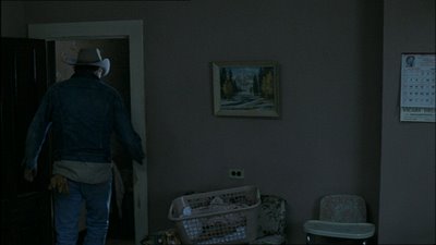


Territorial space within the frame can be manipulated with considerable psychologcal complexity. Whena figure leaves the frame for example the camera can adjust to this sudden vacuum in the composition by panning slightly to make allowances for a new balance in weight. Or the camera can remain stationary, thus suggesting a scense of loss symbolized by the empty space that the character formerly occupied.
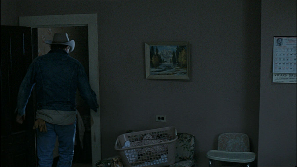

Territorial space within the frame can be manipulated with considerable psychologcal complexity. Whena figure leaves the frame for example the camera can adjust to this sudden vacuum in the composition by panning slightly to make allowances for a new balance in weight. Or the camera can remain stationary, thus suggesting a scense of loss symbolized by the empty space that the character formerly occupied.
water Under the Bridge Resonance Pics PAGE 3
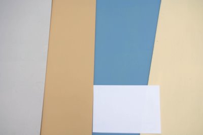
Some colour charts for Production Design, NEW MODIFIED.
Notes: Purple not as strong on wall sample as in swatch.
Remember: some colour saturation will be removed by pull process- Affected colours tend to be bright "poppy" colours, other muted, pastel colours arent affected as much...
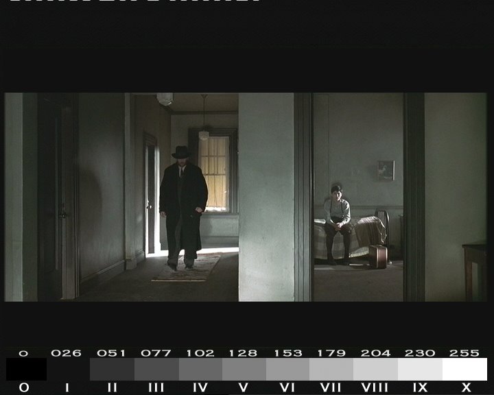
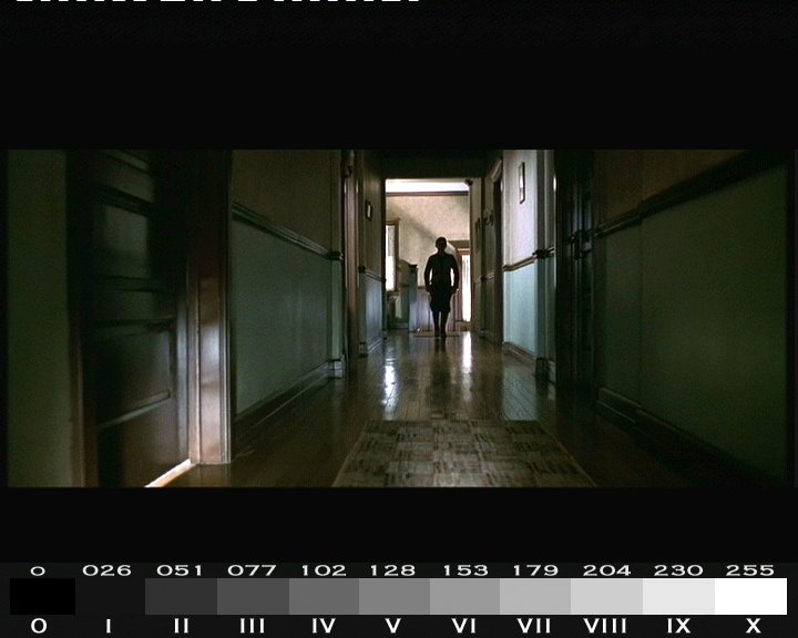
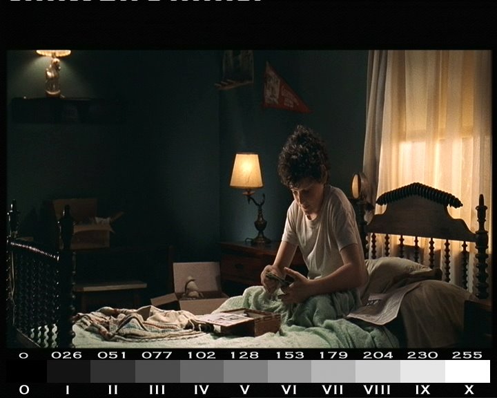
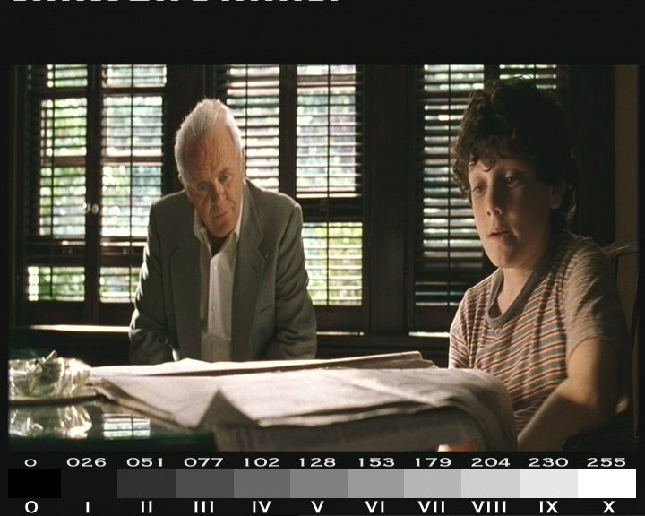
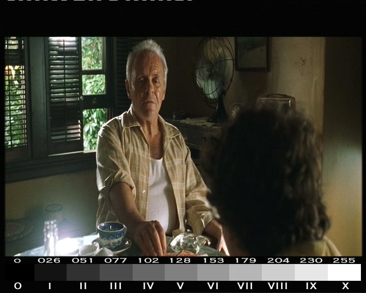
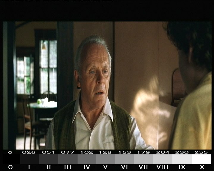
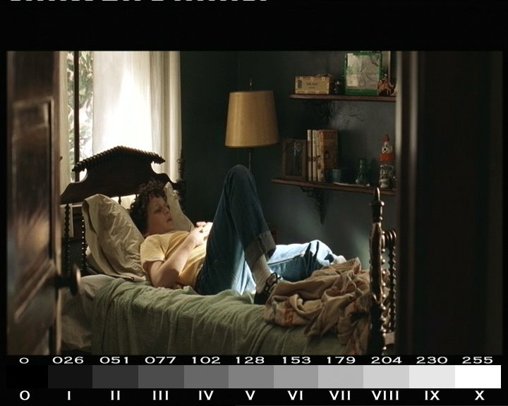
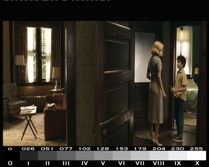
Some lighting exposure ratios from our resonances using Cinemate©glennhanns.

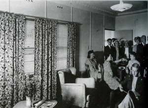
Fibro heaven:
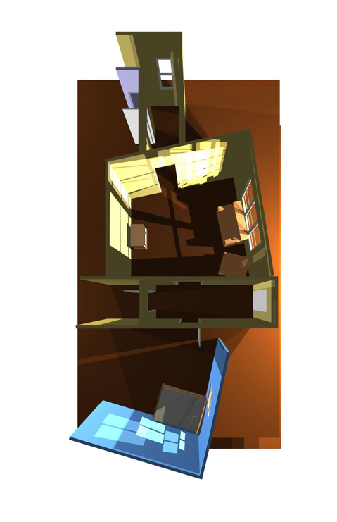
Set Design from Roger:

Notes: Purple not as strong on wall sample as in swatch.
Remember: some colour saturation will be removed by pull process- Affected colours tend to be bright "poppy" colours, other muted, pastel colours arent affected as much...

Some lighting exposure ratios from our resonances using Cinemate©glennhanns.
Fibro heaven:

Set Design from Roger:
Tuesday, September 26, 2006

Subscribe to:
Posts (Atom)